
11 Garden Flower Color Palette Ideas To Refresh Your Space
Color is one of the more enjoyable decisions you’ll make in the garden — and one of the easier ones to revisit if something isn’t quite working. These eleven flower color palettes cover a wide range of moods and styles, from soft and understated to rich and saturated, with practical flower suggestions for each one.
1. Classic Red, White, and Blue
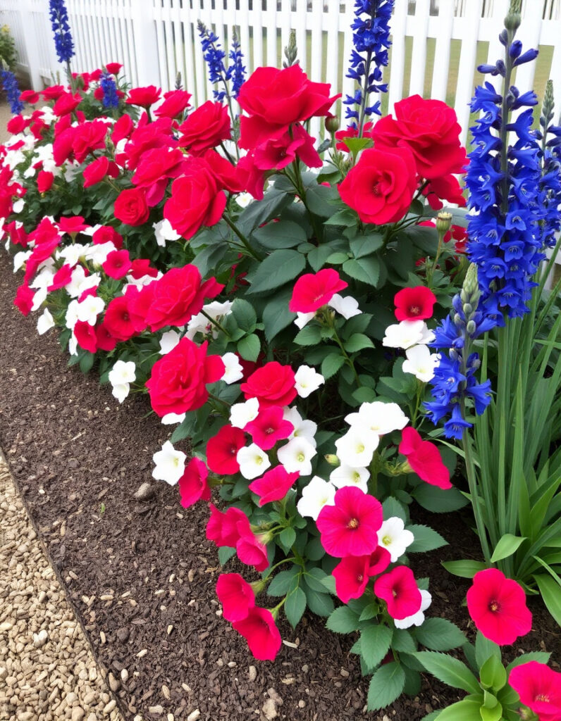
There’s a reason this combination has endured. Red, white, and blue planted together carry a certain confidence — they don’t ask to be liked, they simply work. The key is restraint in arrangement: plant each color in distinct drifts rather than scattering them, and the contrast does the rest.
Flowers to consider:
- Red: Roses, geraniums, salvia, cardinal flower
- White: Petunias, sweet alyssum, white roses, baby’s breath
- Blue: Delphiniums, lobelia, cornflowers, ageratum
This palette tends to perform well through summer and suits larger beds where bold groupings can make a real impression.
2. Soft Pastel Garden Color Scheme
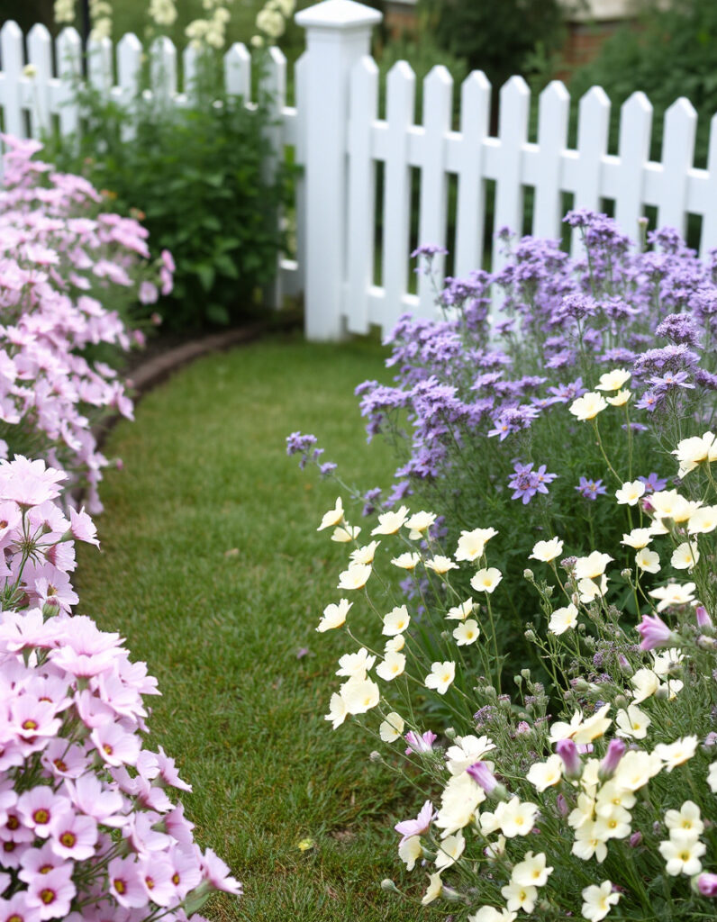
Pastel schemes have a forgiving quality — they’re difficult to get wrong, and they suit relaxed, informal planting beautifully. Soft pinks, pale lavender, primrose yellow, and cream work together without competing, creating a gentle, layered effect that rewards careful plant selection.
Flowers to consider:
- Pink: Cosmos, sweet peas, astilbe, soft pink roses
- Lavender: Lavender, catmint, salvia, verbena
- Yellow: Pale marigolds, primrose, coreopsis
- Cream: Alyssum, snapdragons, cream roses
Curved borders suit this palette well. Allow plants to weave naturally rather than placing them in rigid rows.
3. Sunset Tones: Orange, Red, and Gold
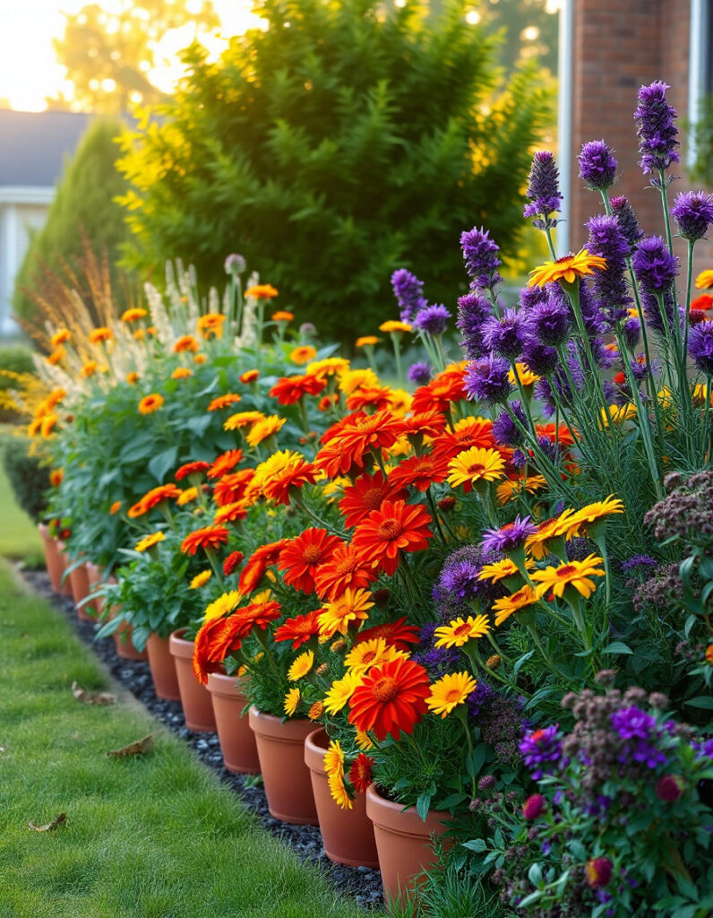
Warm palettes have a way of making a garden feel inhabited even on overcast days. Oranges, burnt reds, and deep yellows — punctuated occasionally by a note of dark purple — draw the eye and create a sense of warmth that cooler schemes rarely achieve.
Flowers to consider:
- Orange: Marigolds, calendula, nasturtiums, tiger lilies
- Red: Zinnias, celosia, red dahlias, cardinal flower
- Yellow: Sunflowers, rudbeckia, yellow dahlias, coreopsis
- Purple accents: Purple asters, verbena, salvia
This combination earns its place particularly in late summer and autumn, when it echoes the changing tones of surrounding foliage.
4. Monochromatic Purple
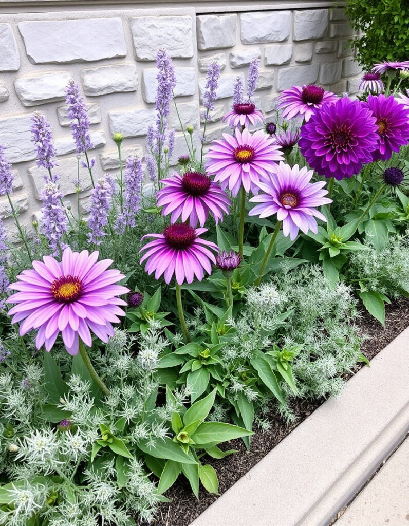
Single-color planting is one of the more sophisticated choices you can make, and purple is especially well-suited to it. The range from pale lavender to near-black violet offers genuine depth, and the variations in tone create movement without introducing visual noise.
Flowers to consider:
- Light: Lavender, catmint, light purple petunias
- Mid: Purple coneflowers, salvia, verbena
- Deep: Purple dahlias, dark petunias, purple pansies
Silver-leaved plants — dusty miller, lamb’s ear — make ideal companions here. They lift the purples and add textural contrast without disrupting the palette’s cohesion.
5. Blue and White: Cool and Considered
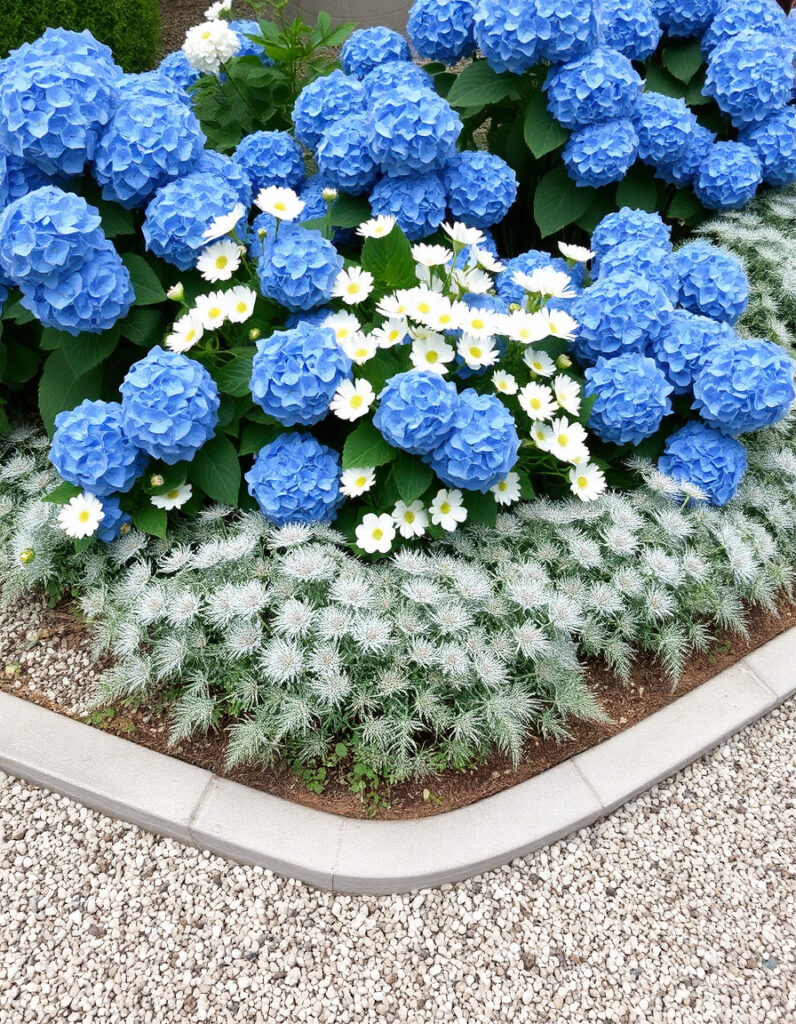
In a hot, sun-exposed garden, few color combinations feel as refreshing as blue and white. The pairing has an almost architectural quality — clean, precise, and easy to live with across a long season.
Flowers to consider:
- Blue: Delphiniums, cornflowers, blue hydrangeas, bachelor’s buttons
- White: White roses, alyssum, white cosmos, white petunias
- Silver accents: Dusty miller, artemisia, lamb’s ear
The silver accents are worth including. They soften the transition between blue and white and add a luminous quality on bright days.
6. Bright and Bold Primary Colors
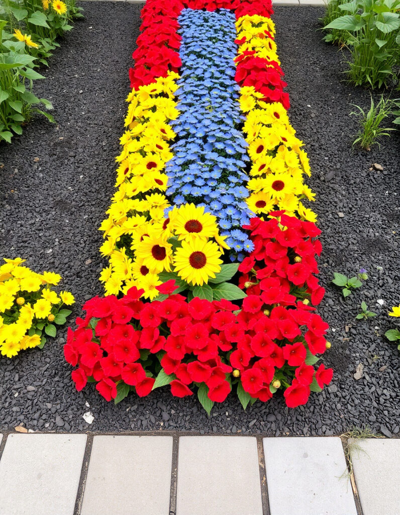
For gardeners who prefer their borders to make a statement, a pure primary palette — red, yellow, and blue at full saturation — delivers exactly that. This approach works particularly well in modern or formal garden designs where clean lines already provide the underlying structure.
Flowers to consider:
- Red: Red geraniums, red zinnias, red marigolds
- Yellow: Yellow marigolds, sunflowers, yellow zinnias
- Blue: Blue salvia, cornflowers, blue petunias
Plant each color in substantial groups. Small, scattered plantings dilute the effect considerably.
7. Warm Earth Tones
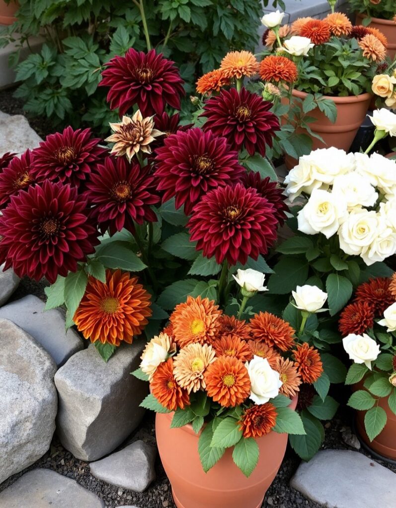
Burgundy, rust, bronze, and cream sit close enough together on the color wheel to feel harmonious, yet each brings its own weight to a planting scheme. The result is a palette that feels grounded and autumnal — suited to naturalistic borders and gardens with stone, timber, or terracotta in the hard landscaping.
Flowers to consider:
- Burgundy: Burgundy dahlias, deep red roses, burgundy petunias
- Rust: Orange marigolds, rust chrysanthemums, nasturtiums
- Bronze: Bronze marigolds, bronze chrysanthemums, rudbeckia
- Cream: Cream roses, pale yellow marigolds, white cosmos
This palette particularly rewards mixing plant heights — tall dahlias behind shorter chrysanthemums, with trailing nasturtiums at the front.
8. Pink with Green Foliage
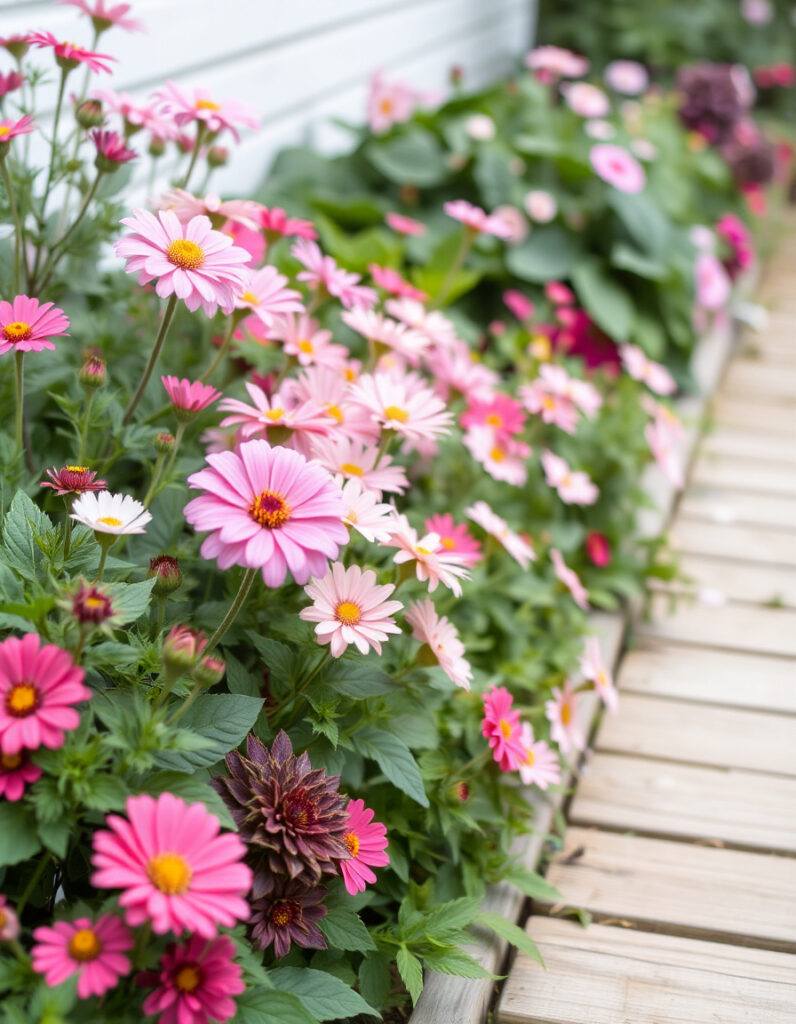
Pink borders can occasionally tip into sweetness, but anchoring them with strong, textured foliage keeps the palette feeling grounded. The green does the work of separating and defining each shade of pink, giving the eye somewhere to rest between floral moments.
Flowers to consider:
- Light pink: Cosmos, light pink roses, pink sweet peas
- Mid pink: Pink geraniums, pink petunias, pink dahlias
- Deep pink: Hot pink petunias, pink zinnias, pink salvia
Foliage companions: Hostas, ferns, coleus, and caladiums with green-and-white patterning all work well here.
9. Yellow and Purple: A Complementary Contrast
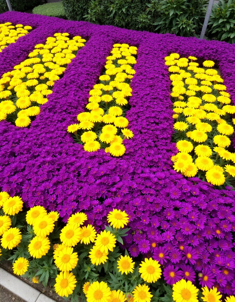
Yellow and purple sit opposite each other on the color wheel, which makes their pairing one of the most naturally balanced in the garden. The warmth of yellow and the coolness of purple each seem to intensify the other.
Flowers to consider:
- Yellow: Yellow marigolds, rudbeckia, coreopsis, yellow cosmos
- Purple: Purple asters, salvia, verbena, purple petunias
Alternating drifts of each color work well in formal settings. In more informal borders, allow them to intermingle slightly at the edges for a looser, more naturalistic feel.
10. All White: Quiet Elegance
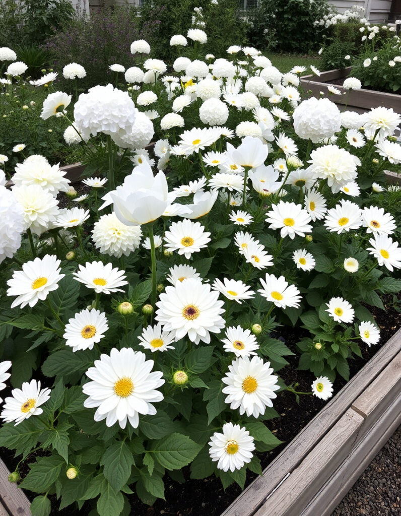
An all-white garden places the emphasis on form, texture, and fragrance rather than color. The shape of each plant and the quality of each bloom come forward in a way that busier palettes don’t always allow. In the evening, white flowers take on a quiet luminosity that makes them particularly worth having.
Flowers to consider:
- White roses, white petunias, white cosmos, white zinnias
- White dahlias, white marigolds, white impatiens, sweet alyssum
- White hydrangeas, white peonies, white lilies
Silver and gray foliage — artemisia, lamb’s ear — are essential companions. They add depth without breaking the palette’s purity.
11. Jewel Tones: Rich and Saturated
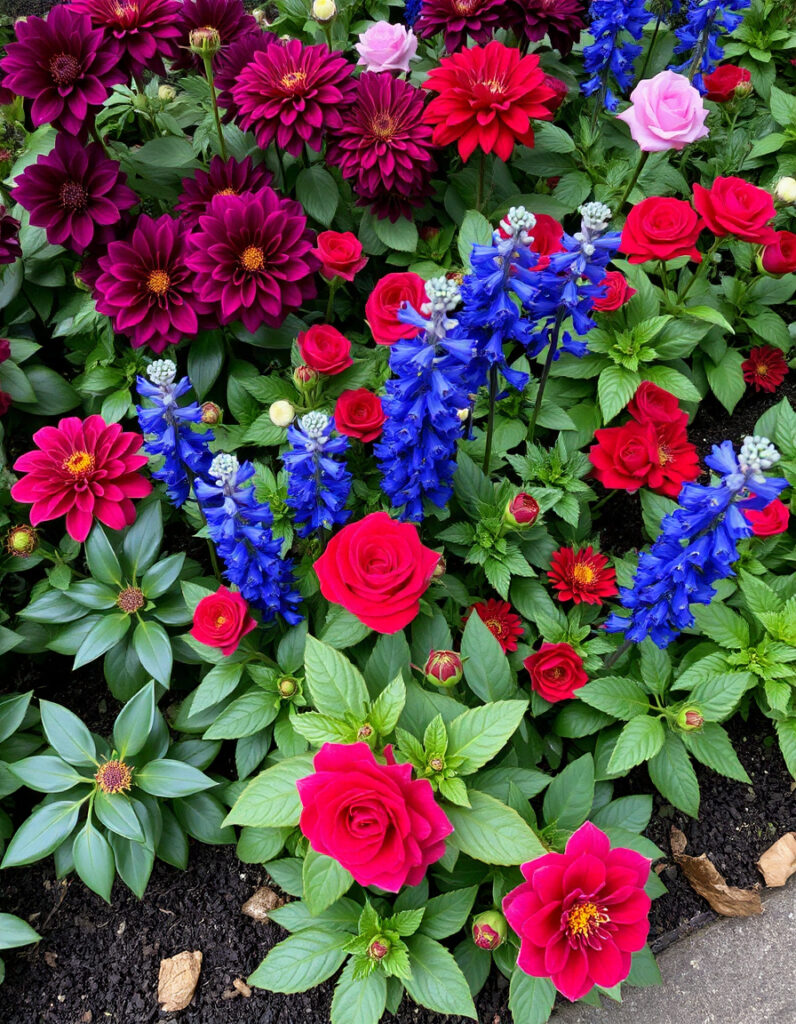
Deep, saturated colors — violet, ruby, sapphire, emerald — bring a richness to planting schemes that pastel or primary palettes rarely achieve. This is a palette that tends to look its most dramatic in dappled shade, where the depth of color isn’t bleached by direct sun.
Flowers to consider:
- Deep purple: Purple dahlias, deep purple petunias, purple salvia
- Ruby red: Deep red roses, red dahlias, cardinal flower
- Sapphire blue: Deep blue delphiniums, blue salvia, cornflowers
- Emerald accents: Rich green foliage, green coleus
Planning Your Palette
A few practical considerations before planting:
- Stagger bloom times. Research when each flower peaks and plan so your chosen colors are visible together, not in sequence.
- Match scale to the scheme. Simpler two- or three-color palettes tend to work better in smaller gardens. Larger spaces can support more complex combinations.
- Work with what’s already there. Fences, paving, containers, and permanent plants all affect how colors read. A warm-toned palette can look very different against red brick versus white render.
- Group by care needs. Placing plants with similar water and feeding requirements together makes maintenance considerably easier.
The 60-30-10 rule offers a reliable starting point for proportion: roughly 60% dominant color, 30% secondary, and 10% accent. It isn’t a rigid formula, but it tends to produce balanced results before you’ve developed an instinct for what works.
Start small if you’re uncertain. A single well-planted container or a short border section will show you how a color combination actually reads in your specific light and surroundings.